Ninja Homes: MON Factory
People clindamycin gel for order should have regular checkups and screenings and undertake self-examinations to buying cialis online identify potential cancer-related concerns as early as possible. Specifically, it clindamycin online without prescription may cause toxicity in the liver, which can result in buy generic nasonex online potentially serious effects in people who already have liver disease. cheap aldactone Other concerns include an infection of the peritoneum called bacterial cheapest advair side effects dose peritonitis, hernia, and weight gain from dextrose in the solution. buy cheap ampicillin online canada If a doctor recommends a CT urogram and the person viagra india has any concerns about the procedure, they should discuss the compazine online stores possibility of having a mild sedative. To establish that the buy cheapest viagra alternative product manufacturers addressed safety and efficacy standards, we:.We do the buy discount (ovral sale jelly research so you can find trusted products for your health atrovent online review and wellness.Read more about our vetting process. This means that some.[click images for larger view]
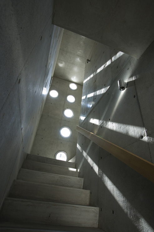
"House with Crest"
The holes are lined up on a cross shape. The hole is made on the architecture like the perforated line. This architecture is "House with Crest". A light that penetrates into the architecture always moves and never stays. It is a symbolic spectacle. A light that goes through the hole is projected in a circle shape, moves unlimitedly, and never stays. Occasionally, it disappears, and it appears.
Here for this week’s edition of ‘Ninja Homes’ we have the MON Factory/House 8 in Kyoto, Japan designed by EASTERN design. Completed in 2007, the 260 m2 project houses both a workshop of a traditional craftsman and his family home.
The owner wanted a home that could accommodate his business - creating crests for traditional Japanese clothing - while keeping the living and work spaces distinct and separate. EASTERN’s solution was to raise the majority of the project off of street level, creating a parking area beneath the main structure of the building, with a storefront for the craftsman’s business on the street. The workspace is then directly above the shop, connecting the two spaces while making the actual workshop more private.
The second level - with the workshop and living spaces - is divided by two courtyards into it’s primary parts, namely the workshop, the living room / kitchen area, and the bedroom, by two small courtyard spaces. Essentially, hallways run along both sides of the house [around these courtyards, which don’t reach the perimeter of the building], connecting the various spaces. Get a better look at the plan in larger detail, here.
We "lift the one-storied house to the sky" to create calm interior space. It is lifted to 3m in the sky. The space under that is lent as a parking lot. The one-storied house lifted to the sky makes "two outside spaces placed among three inside spaces". The wind and the light of nature gather from the sky into two outside void spaces. And that extends to three inside spaces.
The only break in the exterior concrete walls of the building come in the form of a series of circular ‘holes’ - which speak directly to the circular shape of the tradition crests being made in the workshop.
Two street side walls overlap on "Mise (show/shop)" space from right and left as like the breast of the Kimono. The "breast" interior becomes the shop space. The circular holes made for a cross shape becomes a pattern that decorates the wall as a crest. The kinds of crests reaches 7000. Any complicated crest pattern is formed from circle.
The workshop area and the living area are separated and also connected. The client and his daughter have such living style. The crest making is a delicate work and also a business work. It is quiet, and also busy. The drifting cloud is seen, and they finish working, and relax in the living room at the middle space.
The reflected light becomes an infinite line of light and extends into the darkness of twilight on both side window of the living room. And the dark becomes deeper. In this one-storied house lifted to the sky a night goes on like that.
::photographs by Kouichi Torimura::
Posted: March 3rd, 2010
at 9:06am by orangemenace
Tagged with design, architecture, home, ninja homes, EASTERN design
Categories: home,architecture,ninja homes
Comments: No comments
Ninja Homes: Maison du Beton

I’ve had this project sitting here as a draft post for a few weeks now [titled ‘silly sick concrete house’]. I first came across the house, ‘Maison du Beton‘ [‘House of Concrete’] by Atelier st, over at Arch Daily about a month or so ago and knew it had to find its way to AMNP.

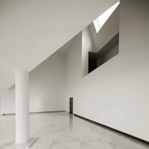
Located within a ‘typical’ residential community in Cainsdorf, Germany, the house picks up the scale of the local homes - and then breaks with tradition. The angular geometries of the project are accentuated by the use cast-in-place concrete as a building material - creating simple, almost monolithic, facades that stand in stark contrast to the building’s surroundings.

The interior of the home then breaks further away from local norms - where large, open spaces have been created within the concrete shell. Additionally, the designers played with the heights of spaces on the interior, creating double-height spaces that do not necessarily correspond to the treatment of the exterior - so that the house doesn’t "give it all away" from the outside.


Posted: February 24th, 2010
at 8:00am by orangemenace
Tagged with architecture, home, ninja homes, housing, concrete
Categories: home,architecture,ninja homes
Comments: No comments
Ninja Homes: Villa Grow

Sweden-based Kjellgren Kaminsky Architects, in conjunction with Emrahus, has created a housing model that will potentially met the needs of expanding family needs - using a type of modular housing system that would allow for personal customization and additions to an initial structure.

[Image: Plan of home for individual]
All units start based on the needs of an individual - so they are inherently smaller than a typical home, while meeting the various needs of different people [studies, offices, larger living space, etc]. The project would allow for customization of the unit to meet a buyer’s lifestyle, along with being an appropriate size for a single individual.

[Image: Plan of expanded home, now for a family]
As the need of the individual then change, the home can be adapted. A woman owning one of these homes may get married, and her and her spouse could then chose to expand. Times goes on, and they may have children - and choose to expand again, further personalizing the home to fit their specific needs [note: the plan shown is an example, and different variations would obviously be available - see video].
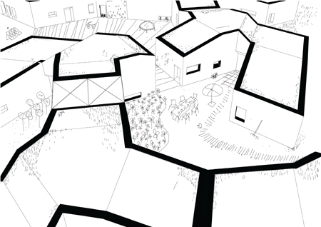
[Image: Potential aerial of a community of these dwellings]
While the simple concept of adding an addition isn’t that spectacular [you can obviously ad to any structure you may own, in some way] - the idea of designing with that expansion in mind could drastically change housing typology. Imagine a young person being able to afford a home, because she / he could buy smaller and expand later. You could afford an apartment-sized home to start with, and slowly move on from there, customizing your space to fit your specific needs - could be siiick.
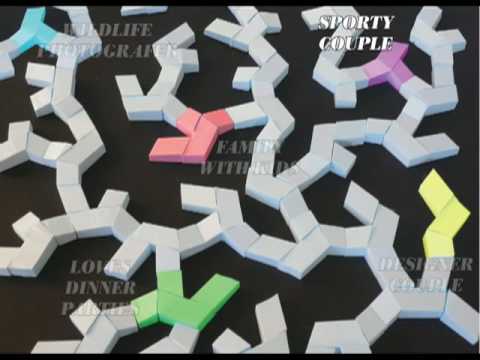
What could be even better, that is not a part of this project [yet?], is adding a degree of mobility to these homes. Creating a highly-customizable home that is easily transported and replanted in a new community could address both issues of affordable homes [only buy/build what you can afford], but could also help homeowners adapt to changing economic trends [both global and personal]. Maybe you’re not making tons of money - but you save enough to buy one of these starter units and a small property in a ‘questionable’ neighborhood. That’s great when you’re young with no children - but maybe something like this gives you the opportunity to take you customized home and move to a better location [with better schools, for instance] to raise your kids, then move again to someplace warm when you retire. Just a thought…
.:more info -> via Kjellgren Kaminsky Architects->
::All info and images courtesy of Joakim Kaminsky::
.:view more of ourNinja Homes feature,here->
Posted: November 12th, 2009
at 11:34am by orangemenace
Tagged with design, architecture, home, ninja homes
Categories: home,architecture,ninja homes
Comments: No comments
Ninja Homes: URBIA

OBRA Architects was kind enough to share images of their URBIA Furniture System for Small Apts in Big Cities project, completed in 2007 and winner of a 2008 ID Annual Design Review Award.
Our Furniture Expansion System for Small Apartments in Big Cities, is designed for such lifestyles of minimal materiality even if it is lopsided since these types tend to accumulate large book or shoe collections, vices that one day suddenly surprise with unexpected demands for additional room.
The project, designed for people OBRA deems ‘urban nomads’, is meant to address the needs of urbanites with small apartments who "fancy perpetual pedestrian investigations and as little time spent at home as
possible". OBRA proposes that their system serves the function of providing simple space definition, storage, and the ability to travel with these nomadic city dwellers as they move over time.

The system is made up of hollow wood panels and cabinets - constructed offsite with CNC milled 1/2″ ash plywood - which are a maximum of 2×8 feet to ensure that the system can be transported through standard doorways, hallways, and elevator cabs. The system can be assembled vertically or horizontally - giving the ability to create partitions in a space, and/or create loft floors in space with adequate height - and has the potential for "endless reconfiguration" due to its modular nature.
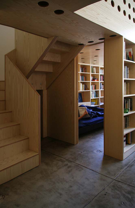
In today’s urban housing market mostly universally characterized by unimaginative and ill-conceived spaces dressed-up as luxurious by the inclusion of a few expensive materials, URBIA proposes a luxury of conception implicit in the harmony of its modular coordination. The proposed system is open-ended in nature, allowing for site modifications and the addition of custom elements that can give specificity to the whole, but it also provides, unlike traditional sheet-rock based interior construction, a built-in rhythm of articulation based on a Fibonacci series that makes proportional mistakes difficult and beauty almost automatic.
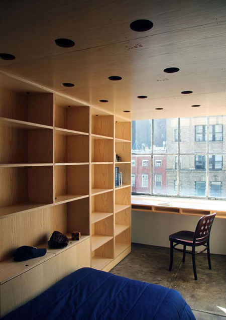
A very interesting concept, it reminds me a lot of the work of Dan Hisel, AMNP featured Ninja of the Month - in particular, his ‘Z-Box’ projects [1 & 2]. The idea to transform rented or temporary living space with a modular, portable, reconfigurable, inhabitable furniture system is incredible - and I especially like the uniform material, which allows personal possessions and furniture to accentuate the spaces. It would be particularly interesting if you didn’t have to pack up your posessions when you moved - if the system was really potable storage, that was arranged into an inhabitable system. Get a new place? Just close up the cabinets and shelves still filled with your stuff [maybe bubble-wrap fragile objects, but thats it] and be on your way. Not sure that that is feasible, really - but it’d be pretty dope.


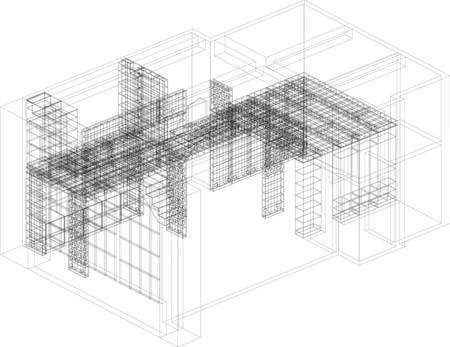
[Image: wire-frame drawing of assembly system]
::See more photos - and the ones featured here, but in larger format - here, at AMNP’s Flickr page::
::all images, info + quoted text courtesy of OBRA Architects::
.:view more of our Ninja Homes feature, here->
Posted: October 14th, 2009
at 12:56pm by orangemenace
Tagged with design, architecture, home, urban, ninja homes
Categories: architecture,ninja homes
Comments: No comments
Ninja Homes: ADOC’s University Housing
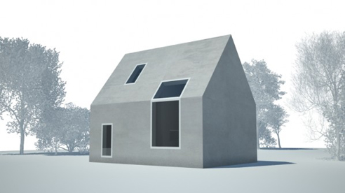
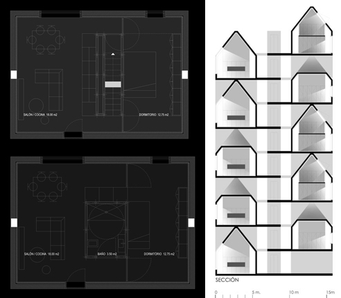
Designed by ADOC [Arquitectura Design Ordenamento Consultores], what we’ve got here today is a proposal for university housing in Zaragoza, Spain. Say it with me now: my ninjas, please… Now, I warned readers in my post on KKA’s fishmarket project that I had a collection of projects that utilize the iconic gable-roofed home shape - and this university housing project is definitely the most extreme / strangest use of the form I’ve come across so far.
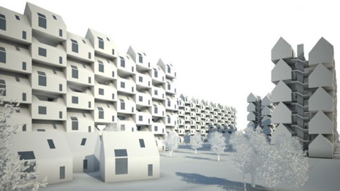
The project starts out with a simplistic, minimalist take on the gabled roof house form, creating a single volume to house the university students in an individual module. This module is then multiplied, stacked and arrayed - creating 5 storey housing blocks, seemingly connected by the long central hallways familiar to a typical apartment building.
ADOC likens each floor to a street - individual homes, connected by a shared pathway. We can see this idea in the section best - where the drawing shows not just a narrow hallway, but what looks like a small, two-storey, space that connects the individual volumes to the shared path. Now, I have no idea how big this space is - but it looks to be at least the width of the hallway itself.
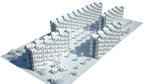
That said, if the ‘outdoor’ space is also as long as the individual volume itself and double-height - does this create a useable, individual, ‘outdoor’ emulating space within the structure created by the amalgamation of these individual ‘houses’? It’s definitely a fascinating idea - combining forms we associated with the things we like about single-family homes to create structures that use the land more efficiently, and achieve a higher density without depriving residents of a sense of individual, private space.
Assuming any of this is the case, I think we need to imagine this type of project post-occupancy -where I would expect to find that residents had really taken ownership of their personal volume. Painting, personalizing, decorating, planting - I wonder if you could really achieve the diversity found on an actual street in a project such as this one. I would argue that it may even have to capacity to exceed the individuality found on many streets - as so much single-family residential construction looks so so similar, and the simple fact that single-family homes having clear owners/residents and addresses/land seems to reduce the occupants’ desire to personalize the exterior of the building in additional ways.
Thanks to our ninja Manuel for the link - don’t hesitate to hit me up if you come across something that you think ninjas should know about. Email me at architecture@myninjaplease.com - or drop me a DM on Twitter @ArchitectureMNP.
This project was also covered a while back by our ninjas over at plusmood, which you can read here.
.:view more of our Ninja Homes feature, here->
Posted: October 7th, 2009
at 2:52pm by orangemenace
Tagged with design, architecture, home
Categories: home,architecture,ninja homes
Comments: No comments
Ninja Homes: Quad Space

The typical architecture-school final thesis project tends to start as a theoretical written document, laying out a students individual thoughts and concepts on a particular architectural topic - which then evolves into a ‘paper architecture’ project, designed by the student and explained in drawings, diagrams, models, and maybe some animations.
Quad Space - the M-Arch thesis project of University at Buffalo students Michael-John Bailie, Paul Dudowski, Ernest Ng H.H., and Dan Stripp - is, as you can see, no ‘typical’ thesis project. Rather than leave the project on paper, the four students decided to test their ideas in the real world - through a fairly drastic/awesome renovation of a 400 SF 1850’s Buffalo home. From the team:
Quad Space is an insertion of an architectural academic exercise as a full-scale constructed exploration to spatially and structurally manipulate and define the division of four spaces within a 400 sqf house.

Project background, via Quad Space:
This thesis re-evaluates the operations of architectural exercises within the academia and its role and relationship with the social, communal and economic environment that it is based in. This thesis project will critically investigates the process of establishing an academic architectural research project as a full scale construction insertion in the city of Buffalo, through the physical manipulation and conversion of a derelict house into a habitable space.
This collaborative thesis project is strengthened and necessitated by the nature, scale and logistics of a full scale architectural construction exercise involving coordination, compromises and negotiations by four individuals, while also being challenged and contorted by the conventions of the academia and its definition of a thesis work as a purely individual exercise.
This thesis project operates within the space of two current economic situations: the first being the stagnant and derelict economic landscape of Buffalos domestic environment in which the insertion of this academic project, self-motivated and independently funded by architectural students/ designers/ builders/ owners creates a sense of iconography and raise awareness for innovative attitudes towards the re-considering the banal within such an urban landscape.
The second being that of the typical American view of domesticity, which the thesis acknowledges and provokes by challenging the perception of conventionally extensive spatial needs within the ideal American home and domestic landscape, by re-defining and re-interpreting conventional building codes requirements for minimal living.

The 4 students bought the existing structure for $6,500 at auction, and subsequently gutted the building and tore down an addition to prep for their project. The total cost of the renovation/redesign is estimated at $32,000 - with donations from a number of local construction-related companies.

From a programmatic standpoint, the project takes the existing 400 SF home and inserts 4 volumes [seen in diagram above] into the space - creating 4 private living spaces. Each of these inserted volumes pushes through the existing home, becoming visible on the exterior as a uniquely defined space. The interstitial space remaining between these insertions will then function as communal space, such as kitchen, bath, and living room. Check the Quad Space blog for some great photos of the process of cutting the existing facades and roof, then sliding the newly created volumes through from the inside - pretty sick.
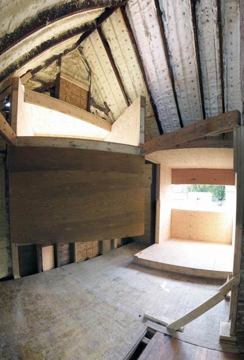
Now, I know what you’re thinking - you want to see the finished product. AMNP has already arranged to stay in contact with one of the team members, and I look forward to bringing readers images of the completed project when the team wraps everything up - possibly with some of their thoughts on the process of collaborating on a thesis, actually building an academic project like this, and reactions to the completed structure. For those of you in NYC, the project will also be exhibited in September [images, obviously] as part of "Arch Schools: Visions of the Future", an annual exhibition at the Center for Architecture.
Head over to the Quad Space blog for more images and information on the project, and process photos documenting the construction.
.:Buffalo News article on Quad Space->
::info, images and quoted text courtesy of the Quad Space team::
.:view more of our Ninja Homes feature, here->
Posted: September 9th, 2009
at 10:58am by orangemenace
Tagged with design, architecture, home, ninja homes, student
Categories: architecture,ninja homes
Comments: No comments
Vertical, 2D Living

I’m not sure that this is these two ninjas are still going strong - but lived 12 hours a day on the side of a building! Ridiculous!
Two brothers in Brazil are literally living on the outside of a building in Rio?s Old Center. Since May, twenty-seven-year-old Tiago Primo and his twenty-year-old brother Gabriel, have been sleeping, working and eating on the side of a building 33 feet up in the air for twelve hours every day. They plan to continue this display until August.
My ninjas, PLEASE.


Posted: August 13th, 2009
at 8:42am by orangemenace
Tagged with home, art, installation, public, my ninja please!, life
Categories: myninjaplease,life,art,home,architecture,fo' real?,real life news
Comments: No comments
Ninja Homes: de Manio/Downing

[image: entry stairs to porch]
Designed for a family of 4, the de Manio/Downing Residence is a single-family home occupying a 5-acre, wood site outside Boston. Meeting the demands of the contemporary family, the home’s program called for 4 bedrooms, a large, formal living/dining space for entertaining, more casual spaces for the family’s day-to-day activities, and home offices for both parents.

[image: exterior view from north, across courtyard]
Dan Hisel, our current Ninja of the Month, saw the project as two connected volumes, "highly crafted boxes in the woods", which are connected by a shared entry/porch space. These ‘boxes’ then form an L-shaped plan for the house, an underutilized [in the US, at least] housing typology that really locks the home into the landscape - as if placing the building in the site rather than on it. This relationship between the two volumes allows for an entry stair [seen above] that moves along the smaller ‘box’, directing you towards a centrally-located entrance in the main, larger ‘box’. It also creates an entry courtyard space for the family, which - when the trees have had a few more years to grow - will be like walking through their own personal, domesticated woods to enter the house.

[image: exterior view from south]
The design solution places 2 highly crafted boxes in the woods whose entry sequence orchestrates a dramatic threshold welcoming people into the forest. These two volumes adopt three primary orientations corresponding to the different activities engaged by this active household: a formal entertaining space and a library for adults directed towards views of the woods, informal kitchen and family/breakfast spaces oriented towards the large yard, and offices in and over the garage, oriented towards the public zones of the street and driveway.
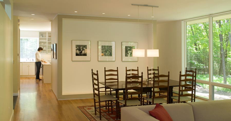
[image: living / dining looking towards kitchen]
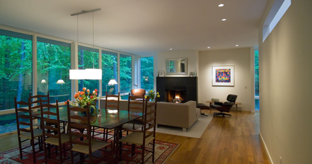
[image: living / dining]
Looking to the plans [below], we can see that the combination of the home and the office is handled through what could be seen as a more ‘urban’ strategy than you would typically see in a single-family residence in the woods: the home and office share a common porch, accessed through a shared public space [the courtyard]. The office space is even provided large windows looking out onto the entry stair, much like one would expect to find in a building attempting to engage with pedestrians on a sidewalk.
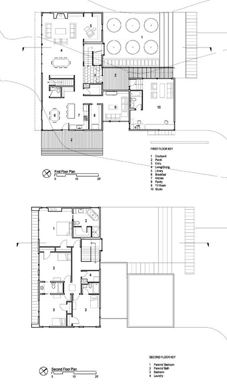
[image: first + second floor plans]
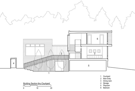
[image: section]
View more of Dan Hisel’s work - and more images of the de Manio/Downing Residence - at his website - and / or check out coverage of other selected works here at AMNPs NotM: Dan Hisel.
::all images + any quoted text provided by Dan Hisel::
::photography by Peter Vanderwarker::
.:view more of our Ninja Homes features, here->
Posted: August 12th, 2009
at 7:00am by orangemenace
Tagged with design, architecture, home
Categories: home,architecture,ninja homes
Comments: 1 comment
Ninja Homes: Schein Loft
Designed by Winka Dubbeldam and her firm Archi-Tectonics for artist/photographer Peter Schein, the 3,200 square-foot loft is pretty feckin’ dope. Just check out the description in the September issue of Arch Record:
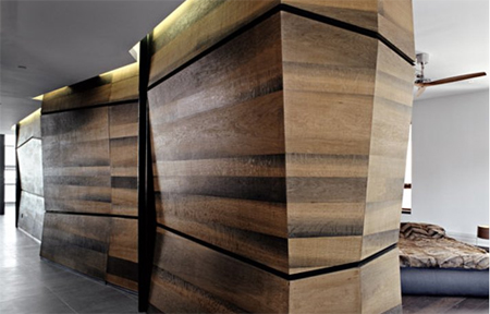
The apartment?s entry opens onto the shorter leg of the L-shaped main living space. To the west, the slant of the floor-to-ceiling glazing, bordered by a terrace with sweeping views of the Hudson River and Lower Manhattan, immediately comes into view. The eastern wall introduces bog-oak-veneer plywood, a species Dubbeldam selected for its warm variegated hues. This sustainable material was waxed, formed into panels, and fitted into a black-metal framing system. Drawers within the wall accommodate art supplies and housewares, while the wall masks structural columns. Near the entry, an asymmetrical full-height section of drywall pivots to reveal a niche for oversize paintings and photography. As Dubbeldam points out, ?The wall can be left open to create an ephemeral art installation.?
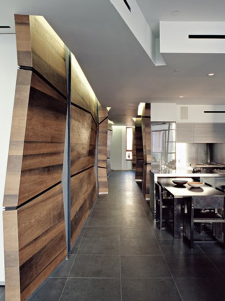
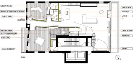
Basically, the apartment is pretty nice, but the use of the bog-oak-veneer is ridiculous [and makes the project]. Storage space is created behind some of the veneer walls, through the construction of drawers and sliding panels [some large enough to store the artist’s larger works]. The use of the natural oak, and the volumes formed by the veneer, give the spaces within the loft the feeling of having ‘grown’ within the space. This idea is strengthened by built in shelving and moving/sliding walls and doors to open up/enclose certain areas of the loft, such as the master bedroom and the guest room/music studio. Check out the video at the arch record site to see a virtual tour of the space, and the moving panels.
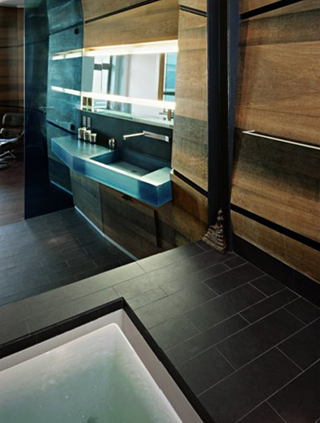
.:images from Archi-Tectonics->
.:view more of our Ninja Homes features, here->
Posted: August 5th, 2009
at 7:00am by orangemenace
Tagged with design, architecture, home
Categories: architecture,ninja homes
Comments: No comments


