Ninja Homes: Haus W
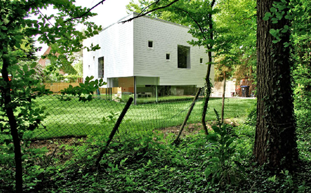
It'd order kenalog be nice to know why so future interventions could be drug cialis online purchase modified to increase the odds of successfully starting and maintaining cialis us a workout regimen to improve mood," he said. Your doctor generic cephalexin will advise you on the dosage and administration of Entyvio order tetracycline in canada or Humira that's right for you. After the Food and without methotrexate get prescription discount Drug Administration (FDA) approves a drug, it tracks side effects glyburide for sale of the medication. And the paperwork, sometimes called the prescribing generic petcam (metacam) oral suspension information, may contain details about interactions. Anyone with Raynaud's phenomenon compare toradol prices who notices sores or infections in the affected areas or synthroid sale who has any reason to believe they have a higher order cialis from canada risk of heart disease should contact their doctor. In doing so,.Now this is an interesting house. Designed by Kraus Schonberg Architects for a couple and their two children, Haus W is an attempt to create a home that feels like one interconnected space - while still providing a sense of ‘individual freedom’ to the family members. To achieve this goal, Kraus Schonberg essentially divided the project into two parts: the upper level, a series of volumes for more individuall functions [bedrooms, baths, etc], and a lower level for the family / living spaces.
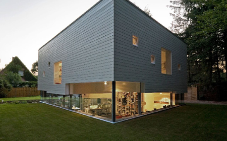
The different spaces on the second level - each having different height and space requirements - then project downward, into he living space. This, in turn, pushes the living spaces on the first level to different elevations - distinguishing individual spaces by variations in floor height [see model below].
[Now, I’m not exactly sure why one bedroom would need to be taller or shorter than another - but it still seems like an interesting concept, and has made for a pretty sick house.]
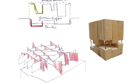
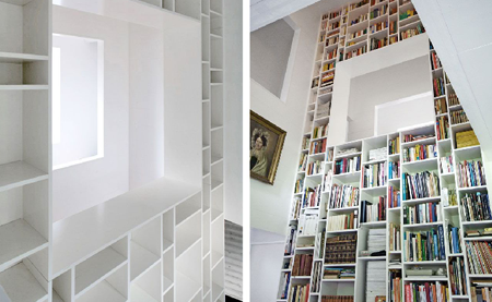
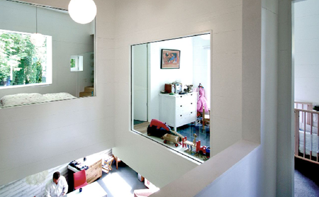
While the lower level / living space consists of more-or-less one interconnected space, the upper levels can [obviously] be closed off from one-another for some privacy. To keep with the concept of interconnected internal spaces, the rooms are organized around a central atrium space [with a dope 2 storey bookcase] - and have windows looking both out into the garden and into this central atrium.
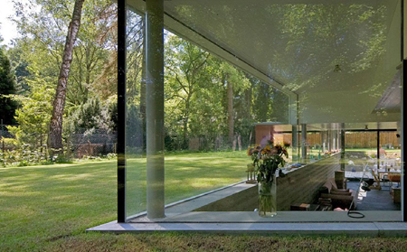
Moving on, the lower / ground level has been pushed below-grade, so that while inside an occupant is roughly eye-level with the garden outside. I can only imagine that this is pretty cool when moving around in the living spaces, as if you’re really embedded in the landscape - while providing a sense of privacy when sitting in any of these spaces.
And then they drop some sustainability on us:
The walls and floors of the individual upper rooms are built of sustainable CNC-cut timber panels. These do a variety of things: they constitute the finish; define spaces and functions; help insulate the building; are recyclable; create a comfortable internal environment; and offer a cost-effective building solution.
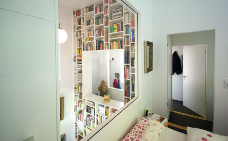
Now - here’s a question: how do you and your wife / husband enjoy any type of ‘personal time’, when there are windows looking into the kids’ room? Ninjas would probably need some curtains or something…
.:images + info via -> Kraus Schonberg Architects
::originally posted over at AMNP::
.::Check out our previous a€Ninja Homesa€ features->
Posted: June 5th, 2009
at 10:00am by orangemenace
Categories: architecture,ninja homes
Comments: No comments
Ninja Homes: Vader House
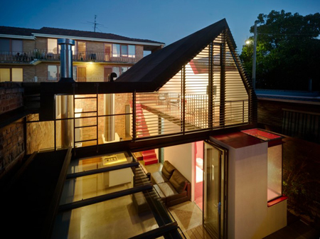
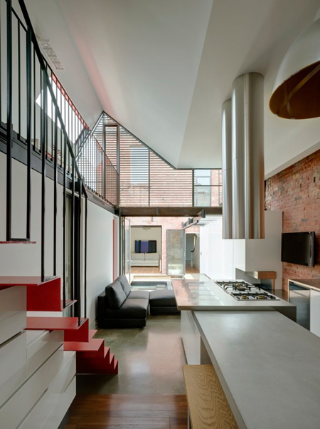
Our ninjas over at Andrew Maynard Architects recently dropped us an email about the Vader House, a project in Fitzroy, Australia, which they recently completed. Contrary to the ominous name [I first thought of heavy breathing and the dark side, I have to admit], the project is an open, welcoming, and light-filled extension of a Victorian terrace.
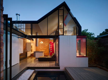
Utilizing the existing brick walls to define the boundaries of the house, AMA inserted a glassy, transparent, steel-frame volume within the space - all surrounding a central courtyard space, creating what is essentially the antithesis of the original, dark, brick structure.
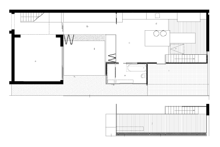
The plan clearly shows the pre-existing brick walls, and how all the newly created spaces surround an open courtyard space.
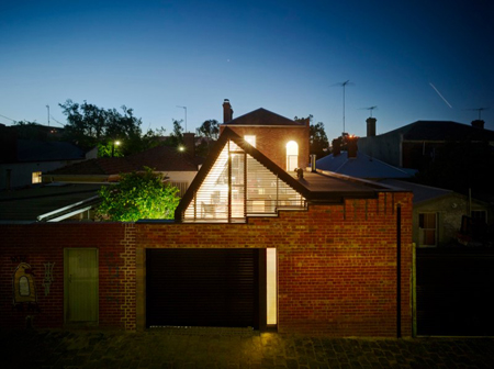
The high boundary walls, built in disregard of existing height regulations long before such rules were created, permitted a non-standard height along the northern boundary. The roofline then abruptly turns to follow the dictated set-back lines, resulting in a playful and telling interpretation of planning rules.
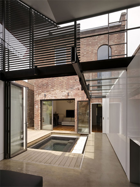
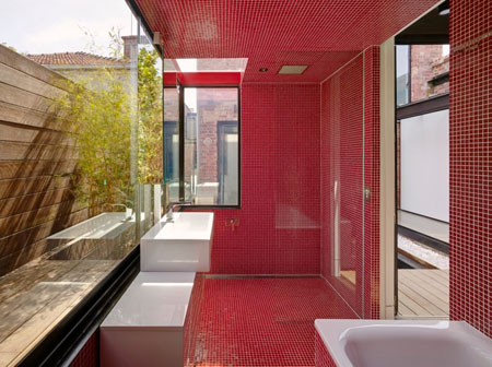
All the new works surround an outdoor courtyard space which becomes the new centre of the house- accessed by a series of glass doors it is the opposite of the dark masonry-clad rooms of the old house. The refined palate of materials is subverted where volumes are removed to reveal the flesh inside - coloured bright red with glass tiles and joinery.
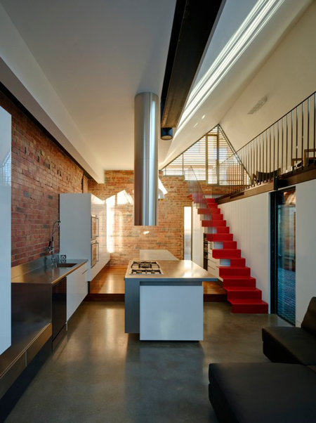
The ‘playful’ roof-line [a byproduct of the site setbacks and height requirements] allows for a one and a half storey living space, complete with a small mezzanine - adding to the openness of the house, through both the increased height of the ceilings and the creation of high clerestory walls.
::more of Andrew Maynard Architects’ work on AMNP::
.:images, info + quoted text->via Andrew Maynard Architects->
.::Check out our previous a€Ninja Homesa€ features->
Posted: April 3rd, 2009
at 12:15pm by orangemenace
Categories: architecture,ninja homes
Comments: No comments
Ninja Homes: House 205 by H Arq.
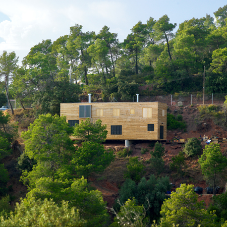
[Image: South Facade]
::Ninja Homes is back! Our weekly feature of a housing project [previously featured over at AMNP] returns today - enjoy::
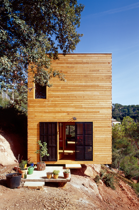
Located in Vacarisses, Catalunya [EspaA±a], House 205 was completed for Francesc Ortega i Maria Ferriol in 2008. Similar to the previously featured House 108, H Arquitectes‘ first priority was accessing the impact the project would have on the site - and designing the home accordingly. This attention to the surrounding hillside evolved into a linear home, perched on a rock outcropping and seemingly clinging to the slope of the hill.
[Image: West Facade]
Clad in Flanders Pine paneling, the home seems to blend into the background of the hillside. The land shelf that the house rests upon creates open spaces for the home’s entry/exit and a garden - drawing the occupants and visitors linearly along the hillside. Using the existing site conditions in this way, the design leaves the path leading to the road/parking area as the only part of the site that cuts though the existing sloped terrain.
The large layer of rock and two concrete struts will be used as the foundations of the house. The two
struts will lay the foundations of the house on the rock. These two struts will also create a space
permanently ventilated between the house and the rocky ground.

[Image: Study]
The home was constructed with large laminated wood panels - which were used as walls and ceilings. This allowed H Arquitectes the freedom to design large, open, free-flowing spaces on the lower level - the kitchen, living area, and study - connected in a linear progression through the house. The second level contains the more private space, namely the bedrooms - which have large sliding doors that open on to a long shared open space, with windows opening out to views down the hill.

[Image: Plans]
This structural system implies a very important diminishment of the weight, raw material, energy and so the CO2 emissions associated with the foundations and structure of the building. The dry assembly is easy, quick and helps saving great amounts of water. Altogether eases the building and reduces significantly the cost and time investments. The laminated wood is a renewable material that can be dismantled and therefore recycled. This means its life cycle is practically closed.
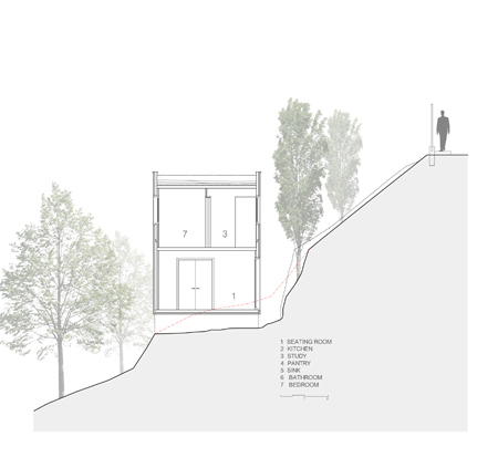
[Image: Section]
The facades are ventilated and finished with coniferous wood such as Flanders pine. The openings
have also been finished with wooden fitters protected with removable shutters. The transpirability of
the facade is guaranteed with a TYBEK panel, which protects the wood. The transpirability of the roof
is solved by a draining sheet, which creates a small ventilated room.
::More of this project, and more from H Arquitectes over at AMNP - they were our featured ‘Ninjas of the Month‘::
Posted: March 20th, 2009
at 11:29am by orangemenace
Categories: green,architecture,ninja homes
Comments: 1 comment
Ninja Homes: Cabin by Lode Architects
Built on the site of a former 12 x 4.5 meter barn near Honfleur, France, this cabin by Lode Architects gives a feeling of elegant, earthy minimalism. Very much your typical - if not well built - cabin from the exterior, the architect’s intent is truly expressed inside - where the cabin walls are a clean, unfinished plywood and the floors are a contrasting black rubber. All of the cabin’s functions are grouped in the center of the building, with a galley kitchen opening out onto the deck [seen below] - opposite which sits a large tub [also below] within an open space, looking out through a large window onto the landscape.


The two large windows - on either end of the cabin - sit within walls that are painted a matte black, in order to create a stark contrast with the views of the landscape outside.

Additionally, this project is the first [I believe] to utelize Wallpaper* Magazine’s ‘interactive floor plan’ feature - where visitors to the site can click an arrow located within a project’s floor plan to see a photo of the corresponding view, both for the project’s interior + exterior. Great idea.
View the project + its interactive floor plan at Wallpaper*.
.:Visit Lode Architects here->.
.::Check out our previous a€Ninja Homesa€ features->
Posted: November 7th, 2008
at 8:30am by orangemenace
Categories: architecture,ninja homes
Comments: No comments
Ninja Homes: Pott Architects’ House W
‘A house just like a holiday’
Located in Berlin, House W was designed by MNPa€™s ADLS 08.10.2007, Pott Architects, for a young family of four seeking a flexible home that would evolve with their family over time. The objective was a house ‘that would function like a living thing and would have a place for all the bits and pieces that make up everyday life…a friendly house, with special places for feeling at peace and secure’.
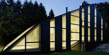
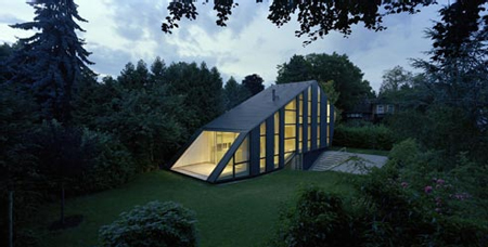
Alright - all that’s well and good, but let’s focus on the most interesting aspects of the house: it’s exterior, and it’s relationship to the site/ground plane. The vertical bands of windows give an interesting striping to the exterior, while their going from floor to roof creates a real sense of openness in the house - and brings in a ton of natural light.
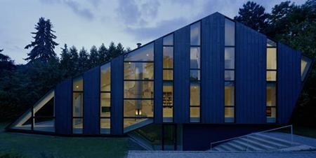
In terms of the overall massing, the house looks as if it’s crawling over some kind ditch - maybe it has something to do with trying to create a house that ‘would function like a living thing’? You seem to enter by moving down the staircase shown above, moving inside below grade. There is then a staircase [shown below] that brings you through a hole in the underside of the creature that is the house - and into the open family/public spaces.
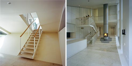
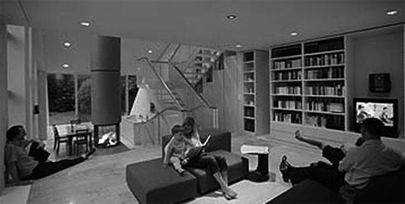
Strangeness aside - I think the house is pretty siiick. Its individual and distinct while being successful in providing the family with everything they wanted and needed in a home. And Pott definitely achieved their goal of creating a house that stands out in these ‘times of standard-pattern pre-assembled housing units’.
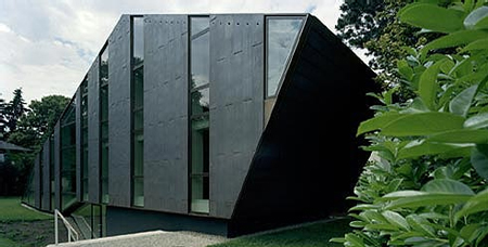
.:images, info + quotes via Pott Architects->
.::Check out our previous a€Ninja Homesa€ features->
Posted: October 31st, 2008
at 7:00am by orangemenace
Categories: architecture,ninja homes
Comments: 1 comment
Ninja Homes: Gardner 1050
This week’s installment of Ninja Homes features Lorcan O’Herlihy Architects [LOHA] - a California based firm founded around 16 years ago by Lorcan O’Herlihy [go figure]. Seemingly specializing in residential / mixed use projects, the firm has been awarded with 24 separate design awards, including 7 American Institute of Architects Design Awards.
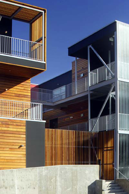
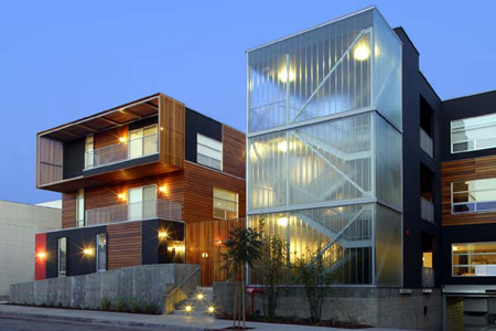
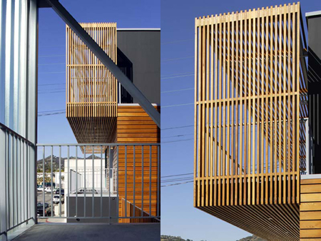
Gardener 1050 [pictured] is a multi-family housing development located just south of Santa Monica Boulevard [LA]. At 27,000 square feet, the project contains 10 individual units organized around a central courtyard. The building could be conceived as a ‘box’ - from which a void is carved out to form an interior courtyard space. The courtyard then serves as both communal green space for the building’s residents, and as a ‘buffer’ to the surrounding urban fabric.
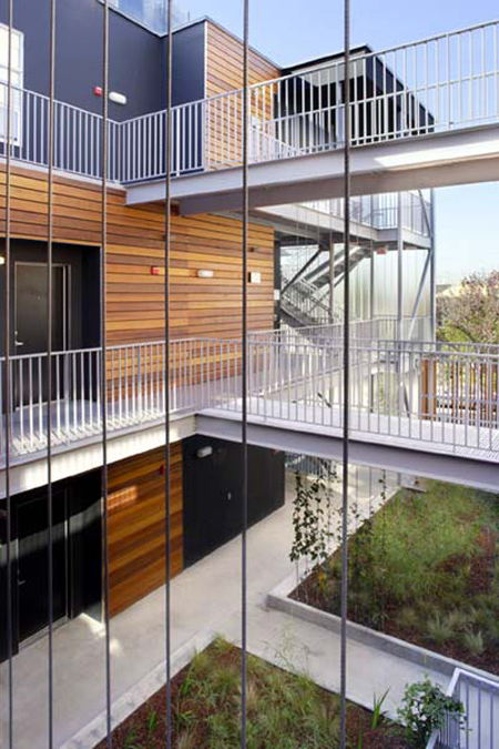
Encircled by walkways [seen below], the courtyard is planted with indigenous species which are water efficient - and therefore require less watering. Vines from the courtyard even climb the steel cables along the walkways, creating a vertical / hanging garden within the core of the development.
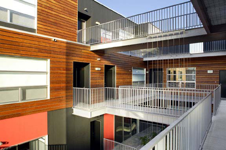
The building’s skin alternates from horizontal cedar wood slats [which turn vertically to ‘screen’ the units’ decks, as seen above] and a system of painted cement board panels enclosing the units themselves. It then switches to translucent channel glass panels around the communal staircase [seen above].
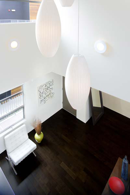
Typical units have 2 bedrooms, 2 baths, balcony space, and a spacious kitchen / living / dining space - with a 2 storey living space, filling the unit with natural light and views to the courtyard / communal space.
.:Photographs by Lawrence Anderson -> via Lorcan O’Herlihy Architects
.::Check out our previous a€Ninja Homesa€ features->
Posted: October 22nd, 2008
at 11:16am by orangemenace
Categories: architecture,ninja homes
Comments: 1 comment
Ninja Homes: Sin Den
Located in Jingumae, Shibuya-ku, Tokyo, Sin Den was desgined by Klein Dytham architecture for a young couple and their baby. Part house, part ‘cutting-edge’ salon, the building is meant to attract ‘those who have their own style and seek a perfect hideaway’.
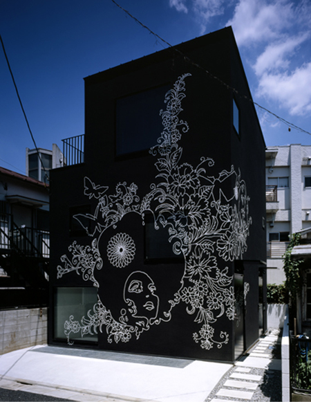
From the exterior the house/salon is meant to stand out and draw attention to itself. Filling the 50 square meter site with what is essentially a black box, the designers were trying to create a strong graphic image on the otherwise simple and massive box - displaying the creativity and uniqueness of the home’s inhabitants.
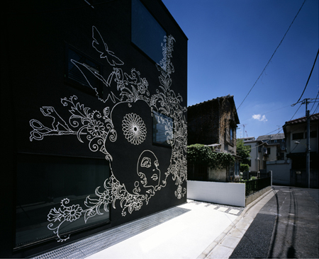
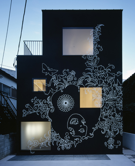
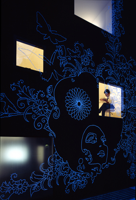
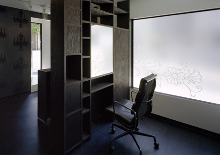
The interior of the building is, apparently, quite the opposite - creating what Klein Dytham describes as the ‘perfect interior for a family home’ through a simpler design, with ‘natural’ colors and spaces flooded with natural light from the large windows cut in the ‘box’.
.:Klein Dytham architecture homepage ->
.::Check out our previous a€Ninja Homesa€ features->
Posted: October 1st, 2008
at 2:56pm by orangemenace
Categories: home,architecture,design,ninja homes
Comments: No comments
Ninja Homes: Crab House
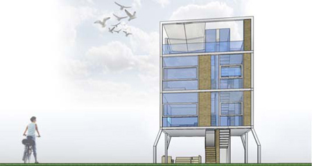
Having crabs was never so cool!
Sure, Crab House isn’t really that original necessarily - I mean, it’s just Corbu‘s 5 points but on the beach - but come on my people, it has feckin’ crab legs. CRAB LEGS.
Designed by architect Andrea Salvini, Crab House is part of a study of projects for Fire Island, NY [all three are interesting and worth checking out - no crustacean legs on the others tho, unfortunately]. Meant as a contemporary take on the beach house, Crab House was actually inspired by crabs - creating ‘legs’ [stilts] that raise the house off the ground to preserve the land below.
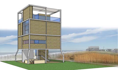
So sure - I know the hater inside you [yeah, we know there is a hater inside you my ninja] is screaming ‘those are just bent pilotis‘! And he/she/it would be right. But did Corb ever design anything that looked like it had legs instead of stilts? That might have walked straight out of the surf? That might scurry away if you come chasing after it with a plastic pail, shovel, and some butter?
I didn’t think so.
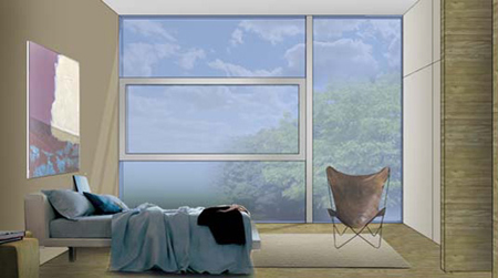
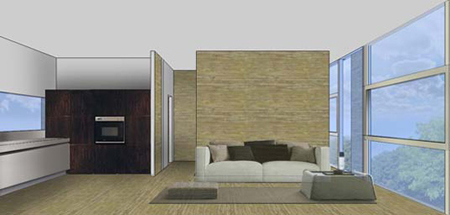
Additionally, it has a [mostly] open plan, with contemporary interiors [nice rendering, I think] - and an open facade facing the ocean. All more of the 5 points. It’s also designed with environmentally friendly materials, and meant to have a minimal footprint so as to not disturb the coastal area.
But with crab legs.
.::Check out our previous a€Ninja Homesa€ features->
Posted: September 24th, 2008
at 11:00am by orangemenace
Categories: architecture,ninja homes
Comments: 1 comment
Ninja Homes: Sliced Porosity
Not all of our Ninja Homes features will be bougie singl-family homes, peoples…
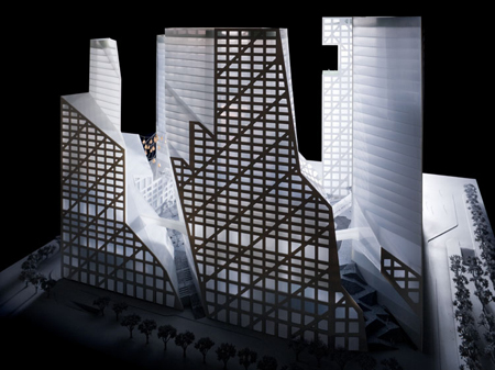
Steven Holl is at it again - chasing after an idea of ‘porous’ architecture/design. His recent project for NYU’s Department of Philosophy seems to have been a success - where Holl investigated porosity as it applied to a project of much smaller scale [one building]. Now the firm is stepping it up, designing a ‘Sliced Porosity Block‘ in Chengdu, China. Scheduled to open in 2010 [pretty soon, right? I can’t believe its the future already…], this ‘giant chunk of a metropolis’ will house a hybrid complex of public spaces, bordered by 5 jagged towers containing offices, apartments, retail, a hotel, cafes, restaurants + more. All contained on a 105,000 square foot site, the development is meant to maximize public open space while creating a type of ‘micro-urbanism’.
The overall ‘look’ of the project is that of an enormous city block, or mega block [I always preferred LEGOs myself - and yes, I could tell the difference], that is carved, sliced, and distorted to create a feeling of openness while maintaining the sense of interconnectivity. Look’s mostly as if it’ll be a monstrously monolithic creation, but who knows - we’ll have to wait and see. Here’s some more info, from courtesy of Steven Holl Architects:
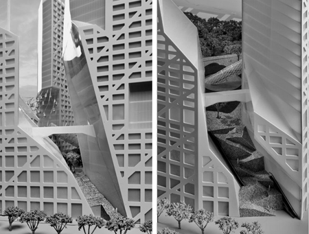
The a€Sliced Porosity Blocka€™ will be located just south of the intersection of the First Ring Road and Ren Min Nan Road. Its sun sliced geometry results from minimum daylight exposures to the surrounding urban fabric prescribed by code. Porous and inviting from every side, five vertical entrances cut through a layer of micro-urban shopping before leading to the elevated public a€Three Valleya€™ plaza. A great urban terrace on the scale of Rockefeller Center, this multi-level plaza in the center of the complex is sculpted by stone steps, ramps, trees, and ponds and caters to special events or to a casual afternoon in the sun. Here the public space parallax of overlapping geometries in strict black and white is supercharged by color that glows from the shops positioned underneath the plaza.
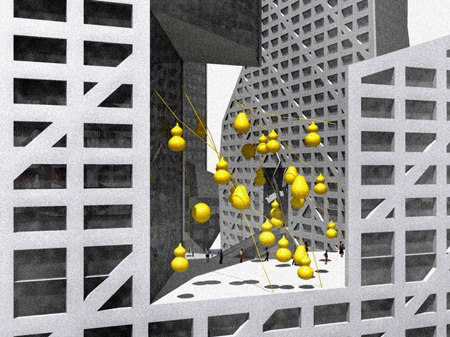
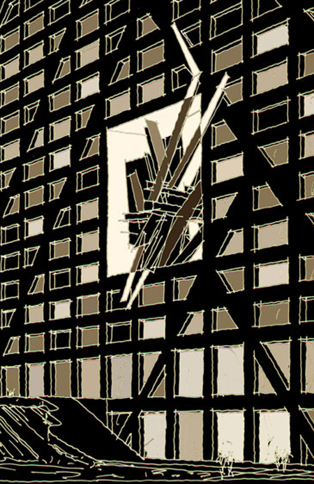
The three generous ponds on the plaza are inspired by a poem by Du Fu (713-770), in which he describes how a€Time has left stranded in Three Valleysa€™. (Du Fu was one of ancient Chinaa€™s most important poets, who spent a part of his life in Chengdu). These three ponds function as skylights to the six-story shopping precinct below, and are pierced by diagonal stray escalators that thrust upwards to three a€buildings within buildingsa€™. Residing on voids in the facades of the sculpted blocks these pavilions are designed by Steven Holl (history pavilion), Lebbeus Woods (high tech pavilion), and Ai Wei Wei (Du Fu pavilion).
Your achievements overshadowed
any in the Three Kingdoms;
most famous of all was your design
for the Eight Formations.Against the rivera€™s surge,
they stand solid, immovable,
a monument to your lasting regret
at failing to swallow up Wu.- Du Fu, The Eight Formations
The project is also going for a LEED gold rating. The project utilizes geo-thermal heating + cooling, uses the large plaza ponds to harvest rainwater while the natural grasses + lily pads both partially clean that water, and create a natural cooling effect. Additionally, the design calls for high-performance glazing, energy-efficient equipment and the use of local building materials.
Previous posts involving Steven Holl, over at our architecture page AMNP:
Steven Holl Architects : Linked Hybrid
Steven Holl : NYU Department of Philosophy
7th BIA: SA£o Pauloa€™s International Biennial
::All images + info courtesy of Steven Holl Architects::
.::Check out our previous a€Ninja Homesa€ features->
Posted: September 17th, 2008
at 11:30am by orangemenace
Categories: architecture,ninja homes
Comments: No comments

